Karikamuri Shanmugan liked this post
Karikamuri Shanmugan liked this post
Karikamuri Shanmugan liked this post
Karikamuri Shanmugan liked this post
Karikamuri Shanmugan liked this post

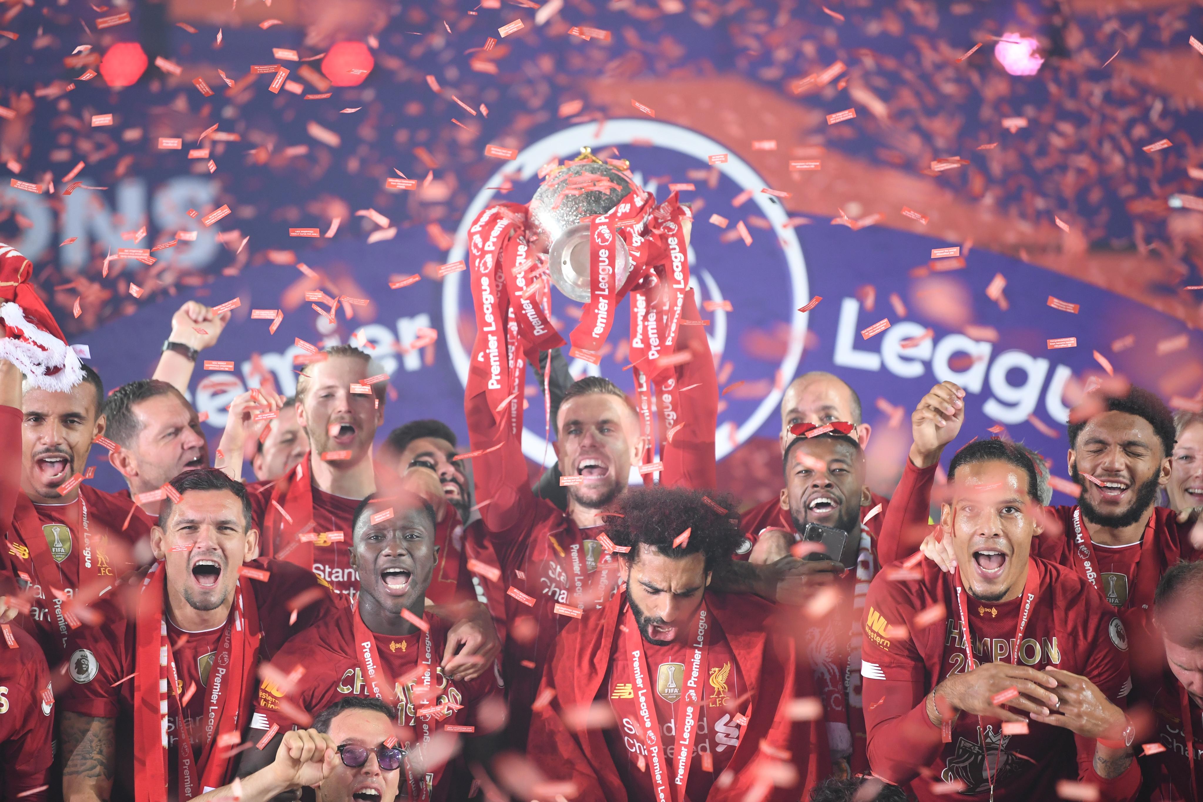
Jordan Henderson has been crowned Football Writers' Association (FWA) Footballer of the Year for the 2019/20 season.
Wow..what an achievement..My captain..
�away � beyond the worldly rules of right and wrong, there is a field; I will meet you there�
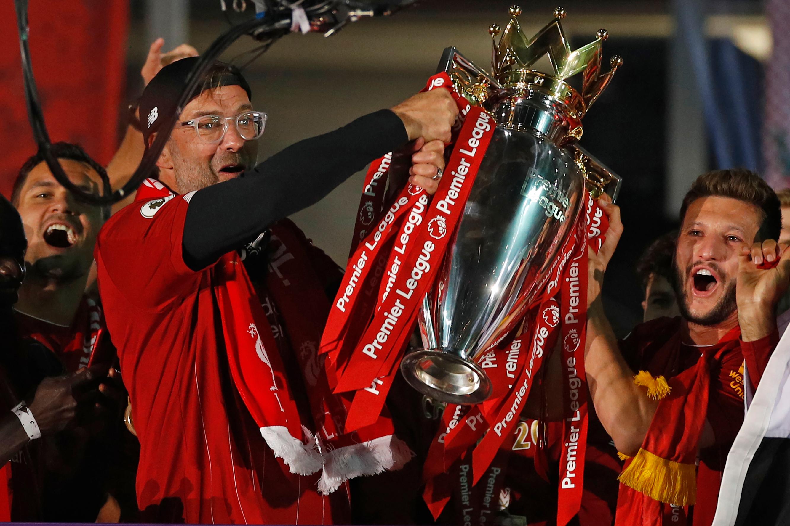
And our boss has won Sir Alex Ferguson award for LMA Manager of the Year too

Karikamuri Shanmugan liked this post
Really a deserving Award......... Congratulations
Originally Posted by sillan

sillan liked this post
Liverpool Logo
Liverpool Logo PNGFor many years, Liverbird was the symbol of FC Liverpool. Taken from the army uniforms, it firstly appeared in the club at the beginning of the XX century, when in 1901, its image was engraved on the championship medals handed to the players. In 1922, the bird appeared on the club flag, created for celebrating the victories of the team in the league. Since 1935, its image has been printed on pre-match programs, and in the 30s, Liverbird appeared on the training suits worn by players at Anfield Stadium.
Meaning and HistoryLiverpool Logo EvolutionIt took another two decades before the Liverbird appeared in the form of the players. The 1950 year is the first time it happened. In the middle of the 1955-56 season, the Liverbird finally took its place on the home form, but this the design was changed. The updated image showed a red bird on a white oval patch, still standing on the pedestal, but the initials of L. F. C. were added under the picture.
Over the next years, the Liverpool logo was changed, but the bird remained an important attribute of the emblem.
In 2012, the Liverpool logo with a yellow Liverbird, reminiscent of the golden years of Liverpool, was returned.
The top of the emblem has a stylized image of the Shankly Gate arch from the Enfield Stadium, adorned with the most famous words from the club anthem called �You�ll Never Walk Alone.�
The burning torches on the sides of the shield are a symbolic image of the lights at the Hillsborough memorial in Sheffield. April 15, 1989, on the eve of 1/2 Cup of England, there was a terrible crash at this stadium. In 1996, fans of Liverpool, including the cousin of the captain of the �red devils� Gerard, were killed.
The year of the club foundation is depicted on the heraldic ribbon in the form of a fan�s scarf.
Since 1901, there is the mythical Liverbird depicted on the arms of the team flaunts, by whose name the city of Liverpool is named. This is a British analog of the Phoenix bird, although it is more like a hybrid of a cormorant and an eagle. According to the official version, the image is borrowed from the old seal of the English King John Lackland.
The triangular English heraldic shield with a predominance of the red color of the club is the basis of the current Liverpool logo, adopted in 1992 (to the 100th anniversary of the club foundation).
Liverpool FC logos are easily recognizable. The central place on them is the Liverpool bird � the famous symbol of the city. This mythical creature first appeared in the club in 1901 � the bird was engraved on champion medals. Then it was used on the flag. And only in the middle of the 20th century did the bird become part of the emblem.
1892
The club�s debut logo is a copy of the city coat of arms. It depicts maritime symbols reflecting the port glory of Liverpool. In the middle of the shield are two cormorants with algae in their beaks. Nearby are the ancient Greek god�s Triton and Neptune. Above is the Latin motto �Deus nobis haec otia fecit� (�God has given us this peace�). Bottom � the inscription �Liverpool Football Club.�
1940s
After World War II, the team changed its logo. In the center is a shield with a cormorant. On the sides are soccer balls. Vertical red and white lines adorn the background. The name of the club is written inside a semicircular frame.
1950 � 1955
In the 1950 F.A. Cup finals, the Liverpool bird, the British counterpart of the Phoenix, first appeared on player shirts. It is believed that the bird comes from an eagle. According to the official version, he was taken from the old seal of King John Lackland. According to unofficial � �crossed� with a cormorant.
1955 � 1968
A red bird stands on a pedestal inside a white oval. He holds a branch in his beak as a symbol of the city�s marine heritage. The initials of the club are written below L.F.C.
1968 � 1987
The oval and pedestal of the logo have disappeared. The design of the bird has changed slightly.
1987 � 1992
The logo is stylized as a champions cup. The top has the shape of a shield and is decorated with a bird. The bottom consists of red geometrical figures on which the full name of the team is written.
1992 � 1993
The anniversary emblem depicts a large billboard with the inscription �Liverpool Football Club 100′ Years�. It houses a smaller shield with a red Liverpool bird. The top is crowned by the Shankly Gates Arch, which is installed in the Anfield Stadium. It says a line from the club anthem: �You�ll Never Walk Alone.� Below is a white ribbon with the years of the team�s existence: �1892 � 1992�.
1993 � 1999
A year after a century, an eternal flame appeared on the logo � a memorial in honor of 1989. The fire recalls the tragedy at Hillsborough Stadium when 96 Liverpool FC fans died in a crush on the podium.
1999 � present
At the beginning of the new millennium, the emblem was modernized. The color scheme has changed: a gradient of green (on the arch) and red (on the shield) has been added. At the bottom of the heraldic ribbon is written the year the club was founded: �Est. 1892�.
2017 � 2018
For the 125th anniversary, designers added the 125th-anniversary inscription to the already existing 2012 emblem. On the sides of the bird, the period of existence of the team is indicated: �1982�, �2017�.
Our manager wins Manager of the season

Karikamuri Shanmugan liked this post
Most dominant league win ever witnessed in England..
�away � beyond the worldly rules of right and wrong, there is a field; I will meet you there�
 Posting Permissions


 Reply With Quote